
Client: Donor center
Task: Branding
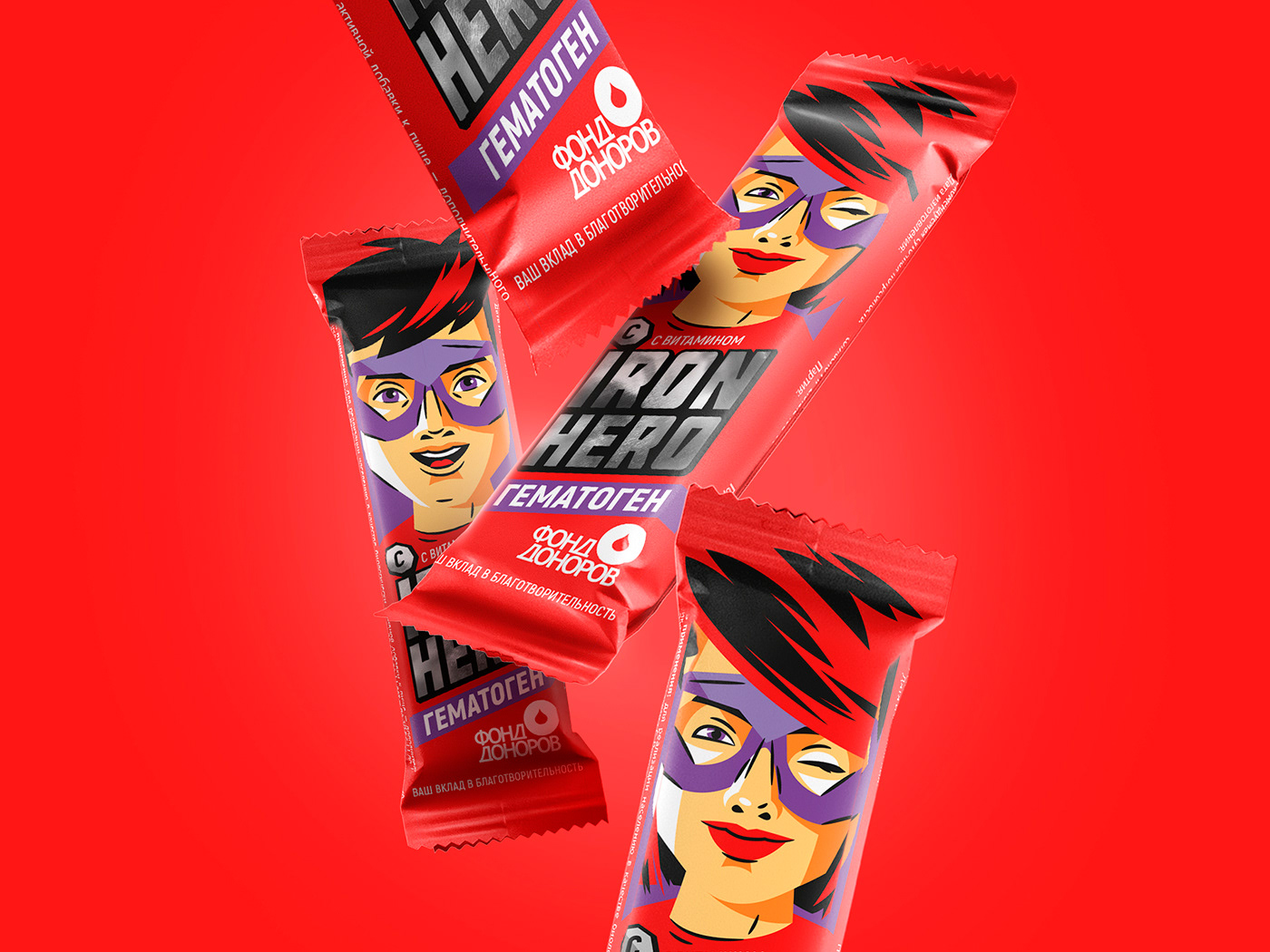
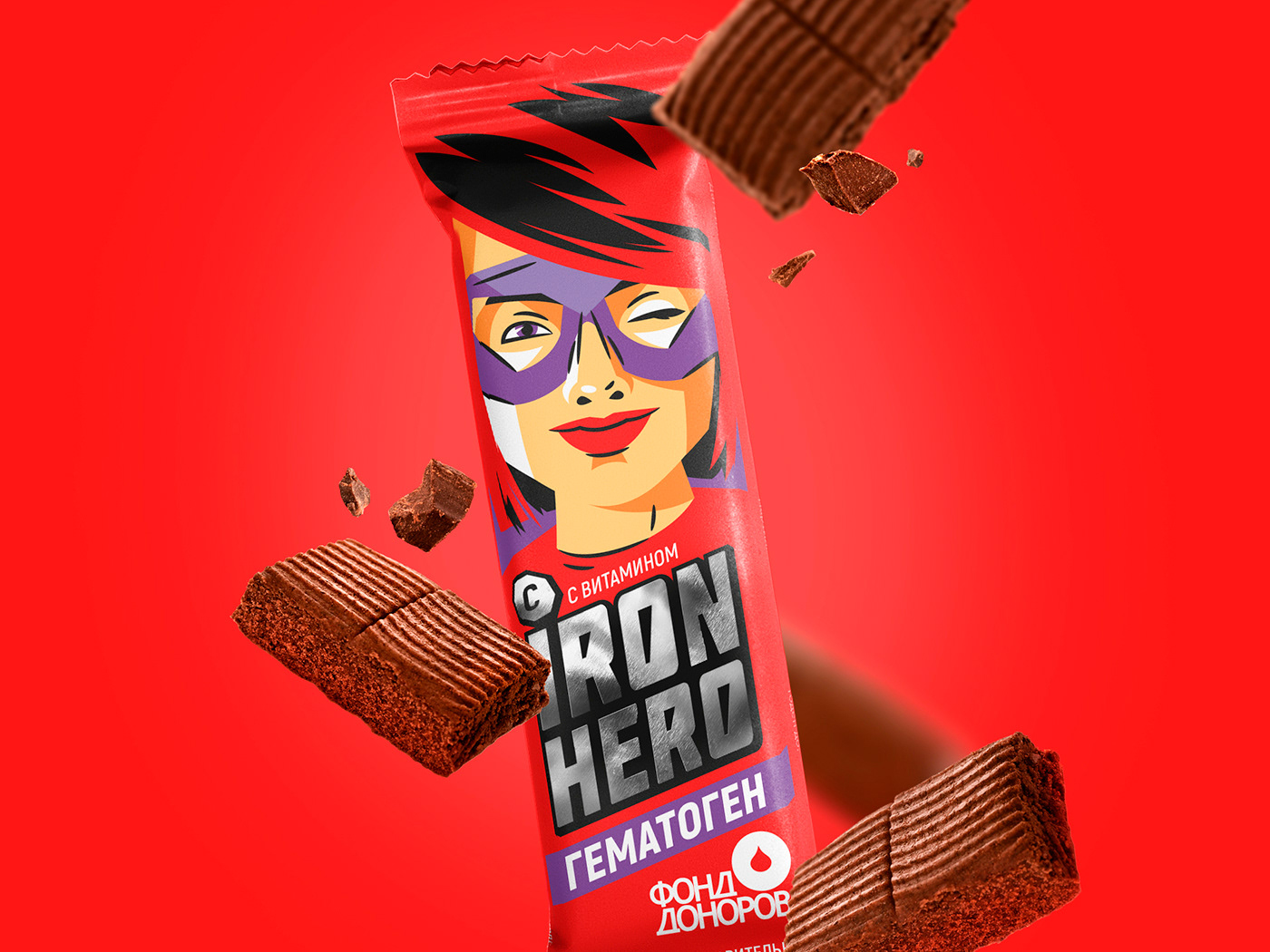
IRON HERO – is a new hematogen produced by Blood donor fund. Fund attracts the attention of young generation to the blood donation problem.
NAMING
There is no hero by birth – there is a hero by decision. That is a cast-ironed, for sure!
We are in no doubt of this fact as well as the Blood donor fund which is launching its own brand of hematogen.
If you ask - What is the connection between blood donors and hematogen? Oh, what a thing!
Iron status – is the most important index and every blood donor knows it by heart.
Iron status – is the most important index and every blood donor knows it by heart.
By the way, hematogen is a well known product and traditionally is meant to be used as an iron replacement therapy.
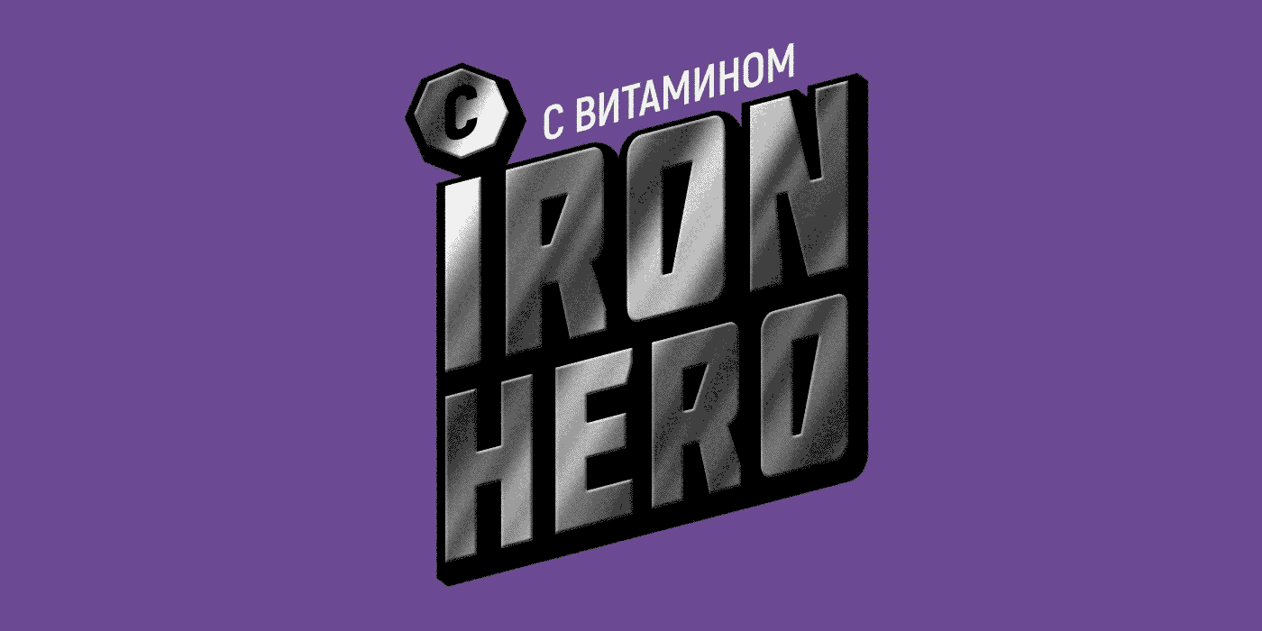
Iron Hero – as a naming makes play with key health benefits of hematogen and at the same time relates to the key message of Blood donor fund that – Everyone can be a superhero!
Conceptual design
That was important in design to make a shift from the classic image of hematogen as a traditional pharmacy product and to create a new, young, modern image of a healthy snack – instead of chocolate tablet and nibbles.
Conceptual design is based on the images of superheroes. Images are done in a modern graphical stylistics which is also corresponding to comic strips design.
This is a message to the young boys and girls – Everyone can be a superhero!
For more information about how to become a donor go to: https://fonddonorov.ru/

AwaRDS:
MEDMEN HEALTHCARE CREATIVE AWARDS
SILVER 2022


